Typography
Typography is a key tool in design language. A typeface can elicit subtle unconscious emotional responses and associations from design elements such as soft curvature, sharp angles, line weight, and complexity. This semiotic interpretation of type can represent brand values or ideology.
As a tool, typography can elevate brand identity, consistency, and recognition, as well as create a clear textual hierarchy and emphasis.
Our Typefaces
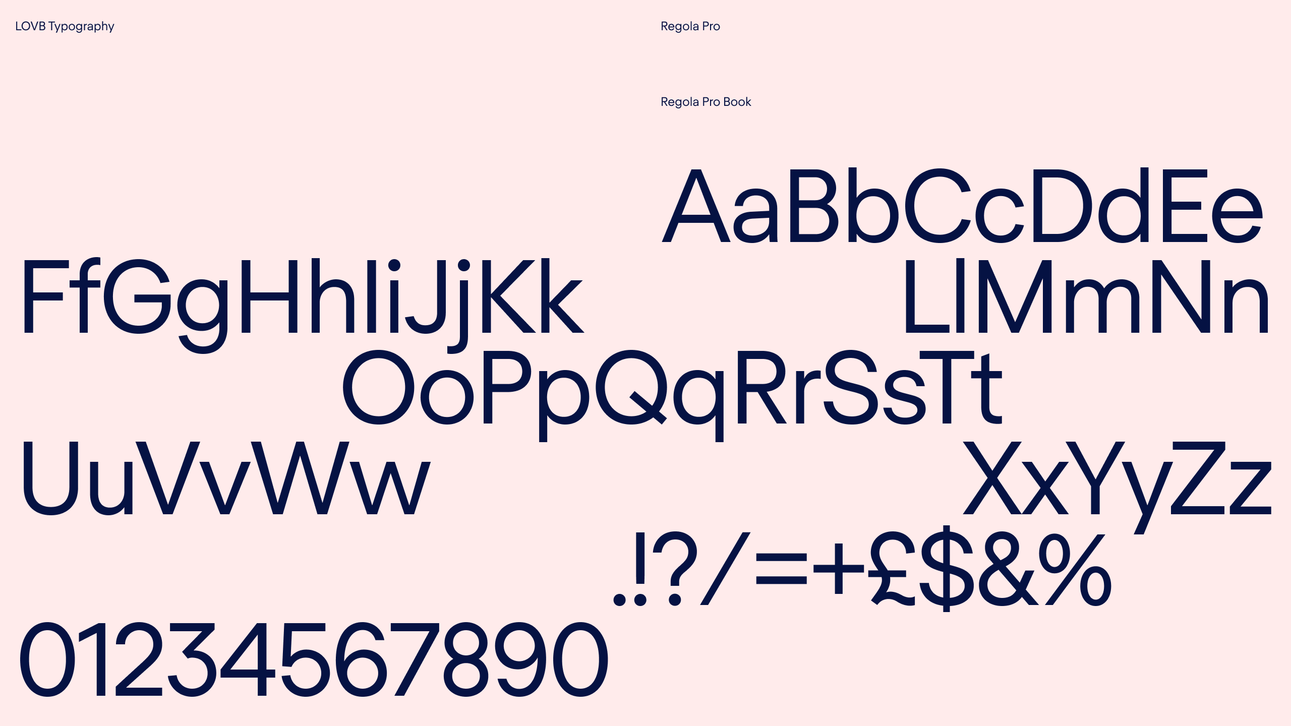
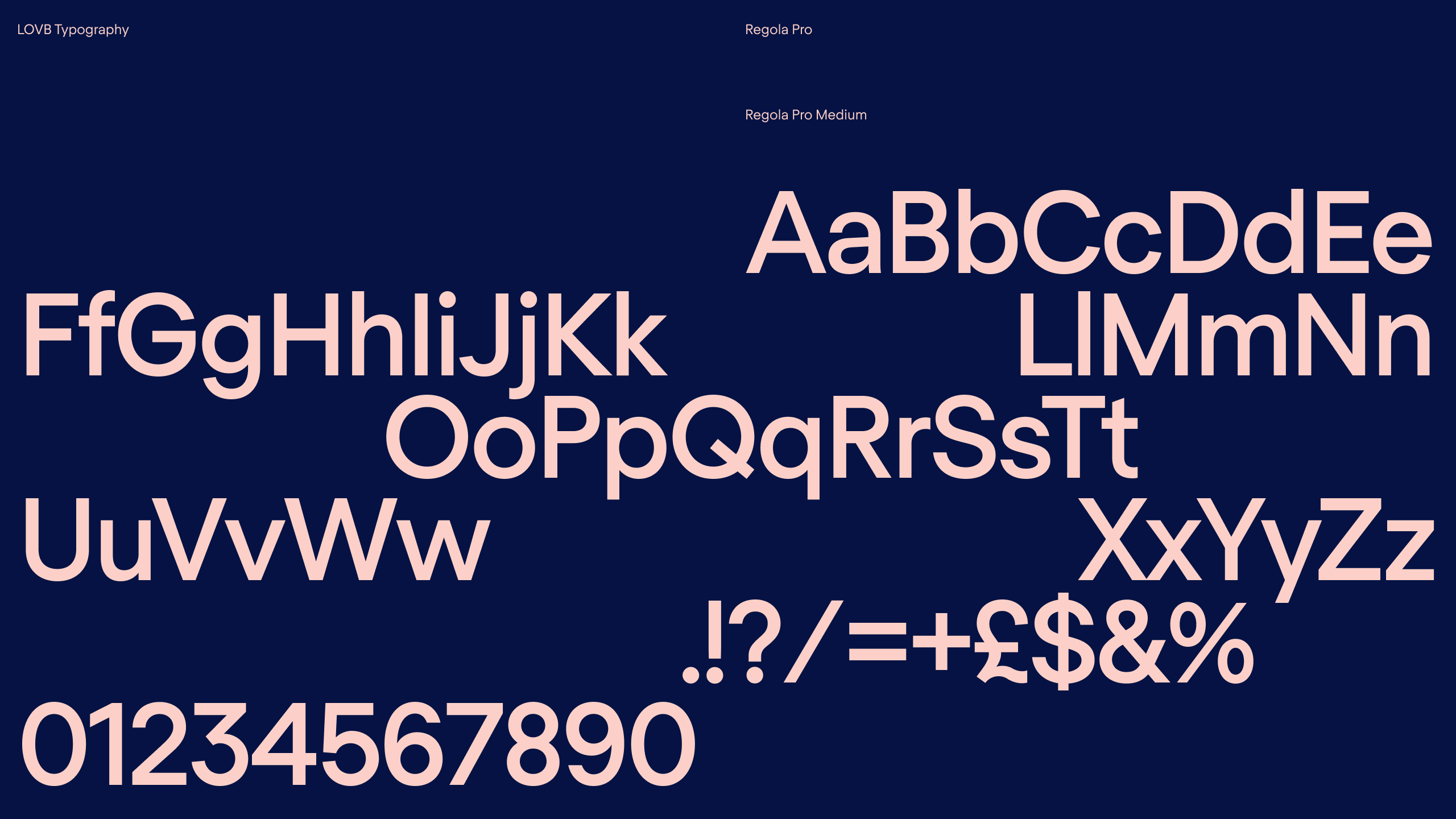
For LOVB, Regola Pro is clear, simple, and impactful. Gentle curves are welcoming and approachable yet the line weight is commanding and purposeful, respectively mirroring LOVB’s tribal spirit and bold ambitions.
We try to only use the Book and Medium weights where possible. The strong form and modern aesthetic make it perfect for both text and headline. The wordmarks are based on the medium weight to allow for the occasional use of the LOVB Mark in headlines (see LOVB FOR LIFE above)
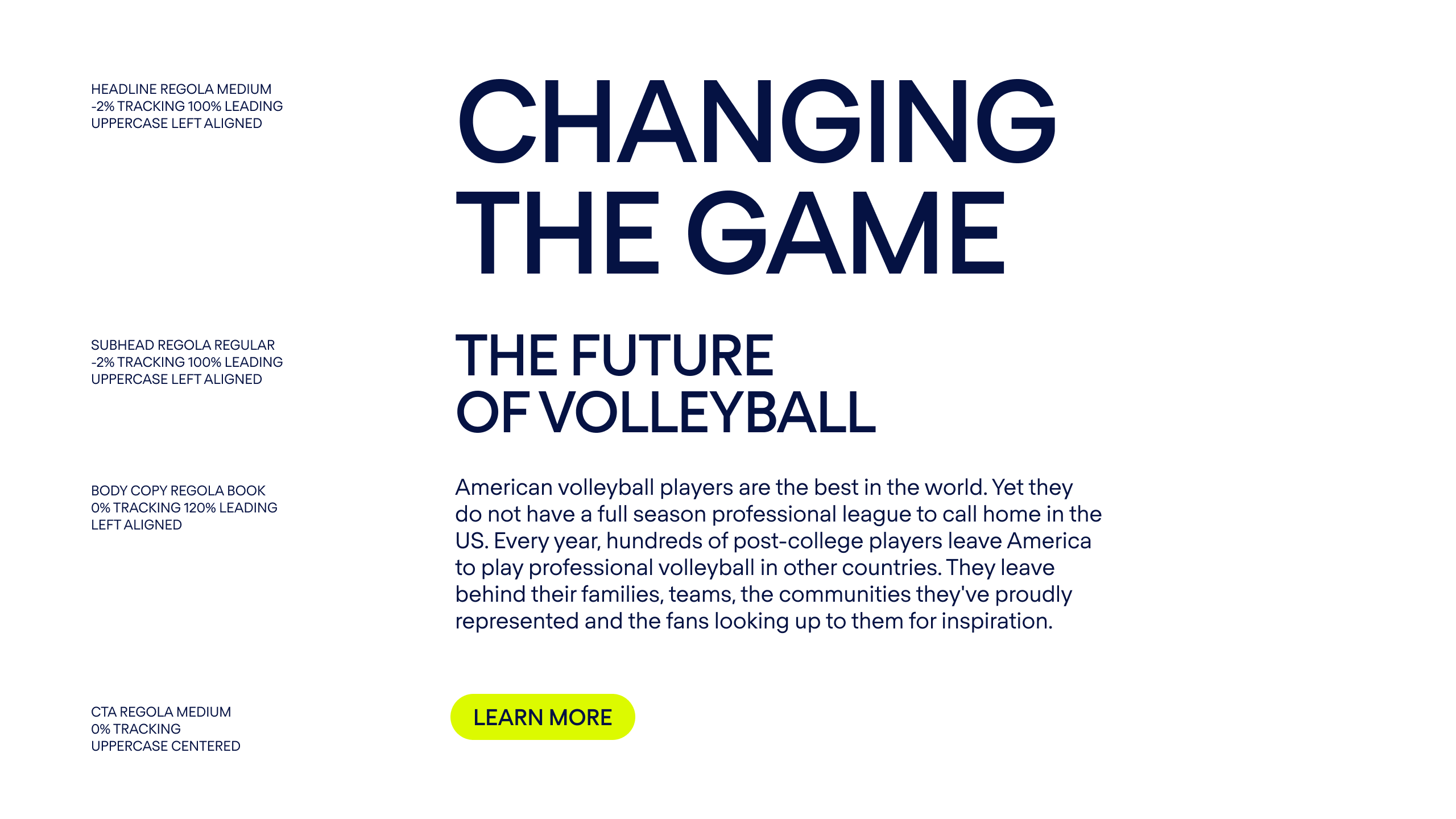
Since we only have one typeface in our system it is important to utilize scale for hierarchy. Take this site for example — the entire document has been set with only the Medium and Book weights, with the size of the type creating emphasis where needed.


Typographic hierachy
In online situations where it isn’t possible to use Regola Pro we recommend using the typeface ‘Plus Jakarta Sans’ which shares many of the characteristics of Regola Pro. This typeface is available as part of the Google Suite and also as a download from Google Fonts.

Alternative typefaces
In online situations where it isn’t possible to use Regola Pro we recommend using the typeface ‘Plus Jakarta Sans’ which shares many of the characteristics of Regola Pro. This typeface is available as part of the Google Suite and also as a download from Google Fonts.
Resources
Regola Pro fonts
↓
Regola Pro webfonts
↓
Plus Jakarta Sans fonts