Wordmarks
Our wordmark is our most valued asset. It’s the first sign of LOVB, the first impact of LOVB on life. It diferentiates us from other organizations, provides instant brand recognition, and embodies the essence of our sport, people, values, and business.
Much more than a stylized name, our wordmark is a banner under which to rally, a flag to fly, and a mark of allegiance and belonging. It is the face of a cultural new wave, the rise of a million athletes, and hope for equality.
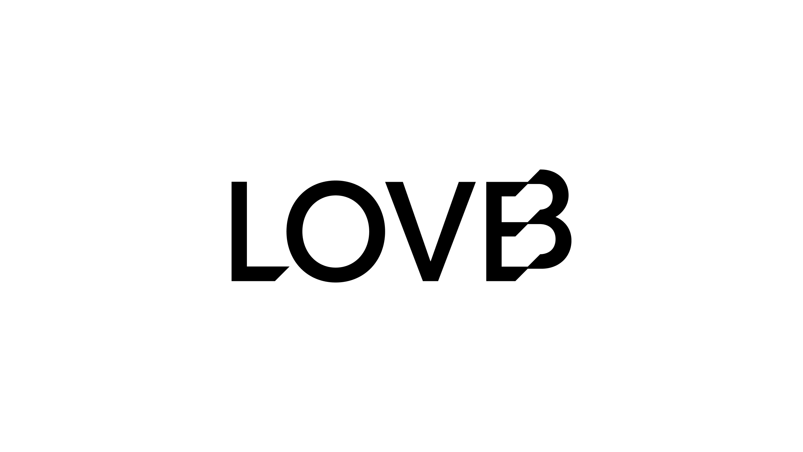
The Familiar Wordmark
This is our ‘primary’ wordmark. We use this when the audience knows who we are and what LOVB stands for.
The shift in the ‘B’ helps the logo say ‘LOVE’. It was a little gift there to be found, it has a bit of logic, and a bit of magic… but more importantly it expresses the movement, both physical and societal, that LOVB represents.
The Full Wordmark
The League One Volleyball wordmark is often (but not always) used in conjunction with the primary mark. It should always be present when we suspect the audience might not yet be familiar with us.

Using The Wordmarks Together
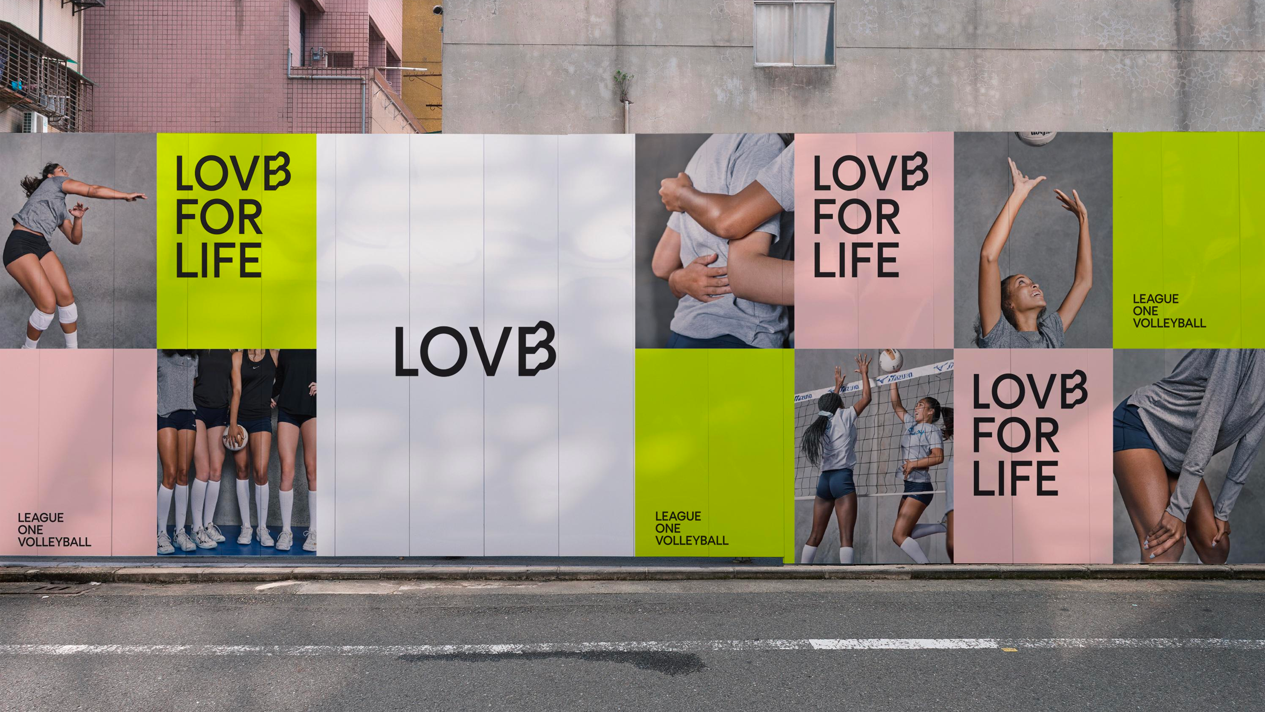
Color
Positive Wordmark
Our wormarks are flexible.The wordmarks stand out when worked positively out of light or bright backgrounds.
Negative Wordmark
You can also use the wordmarks reversed out in white or our lighter brand colors when set against dark backgrounds.
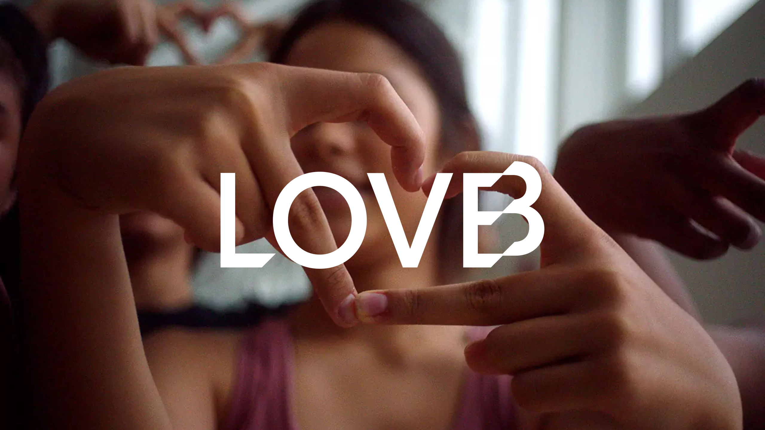
Over Imagery
Ensure that there is sufficient contrast between the wordmark and imagery.
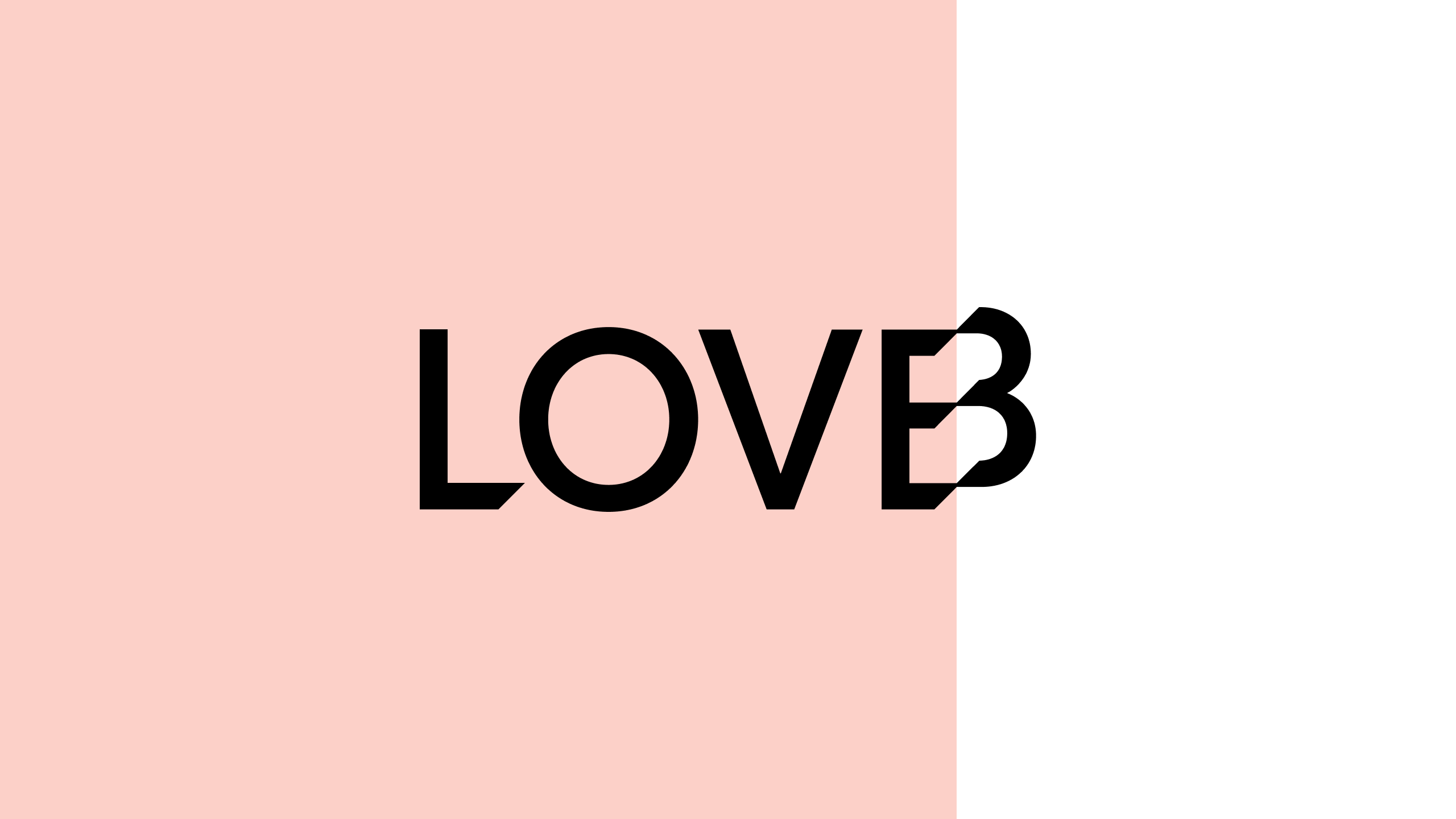
Using The ‘Shift’
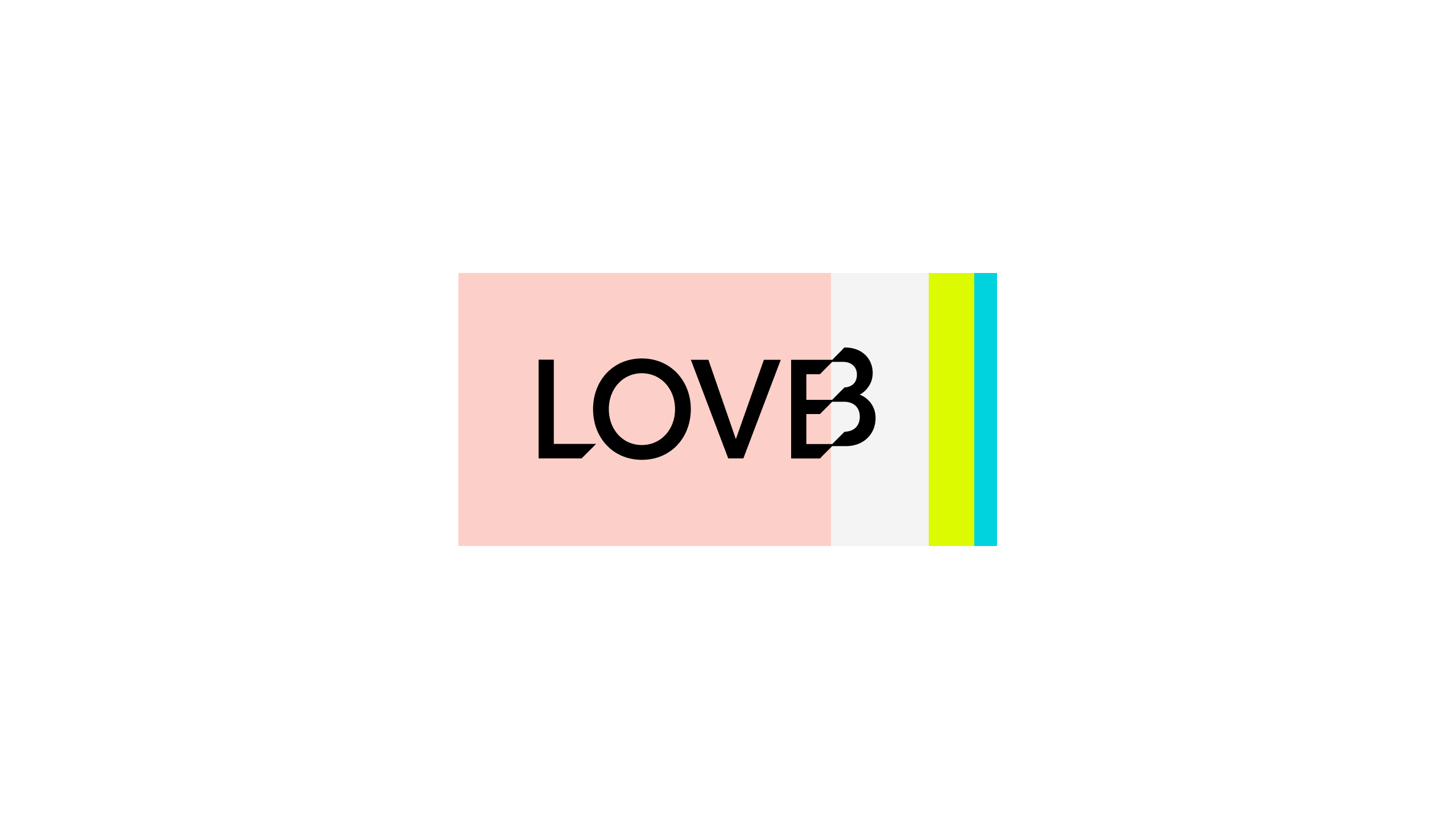
The wordmark can be positioned so it is bisected by blocks of color. Always ensure this only happens at the start of the EB shift.
Color Blocks
The wordmark can be contained within blocks of color of varying widths. Always position one of the color bars at the shift. Ensure you follow the guidance around clear space.
Vertical Blocks
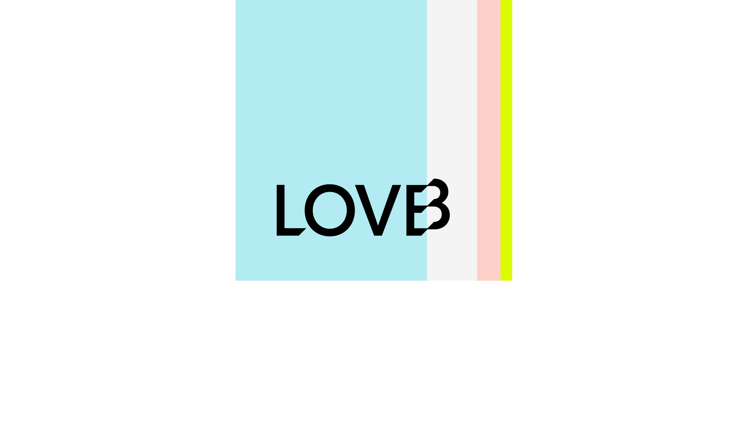
The color bars can extend to the edge of the page screen.
Usage Rules
Clear Space
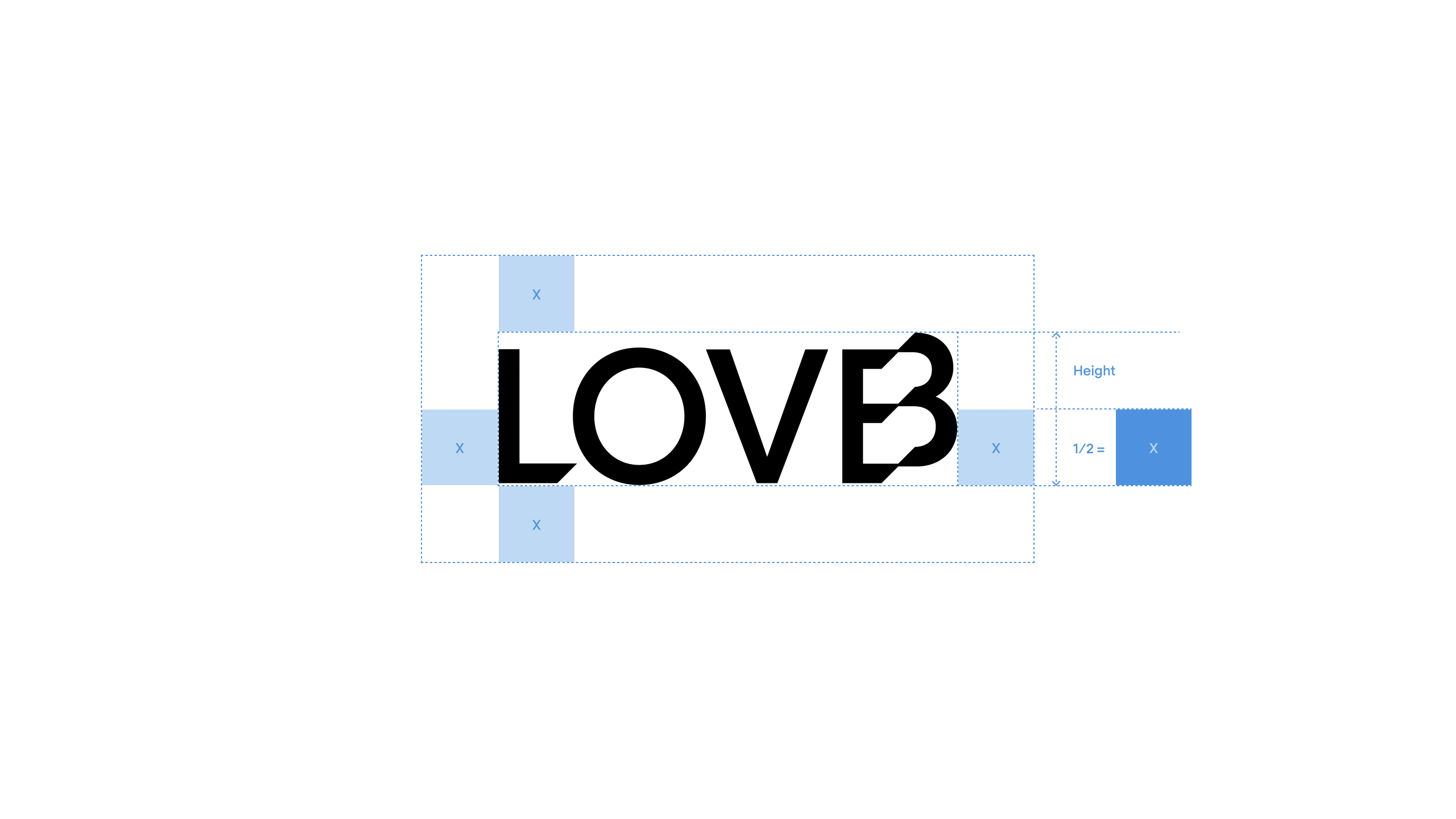
To ensure integrity and visibility, the LOVB wordmarks should be kept clear of competing text, images, and, graphics. They must always be surrounded on all sides by adequate clear space.
For the wordmark that space is equal to “x” which is half the total height of the wordmark.
Minimum Size
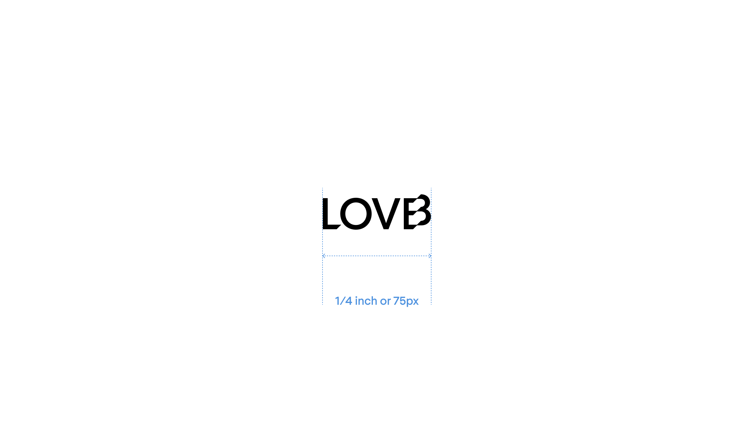
The LOVB wordmark should appear no smaller than 1/4 of an inch (6.5mm) in print or merchandise and no smaller than 75 pixels wide on screen.
In special cases, provided that the legibility and integrity of the LOVB wordmarks are retained, the rule on minimum size might not be applied, but only with the prior consent of the LOVB marketing team.
Position & Rotation
The LOVB Wordmark can be positioned in either of the four corners of the page. It can either be positioned horizontally or vertically. When positioned vertically it should always be with the L at the bottom.
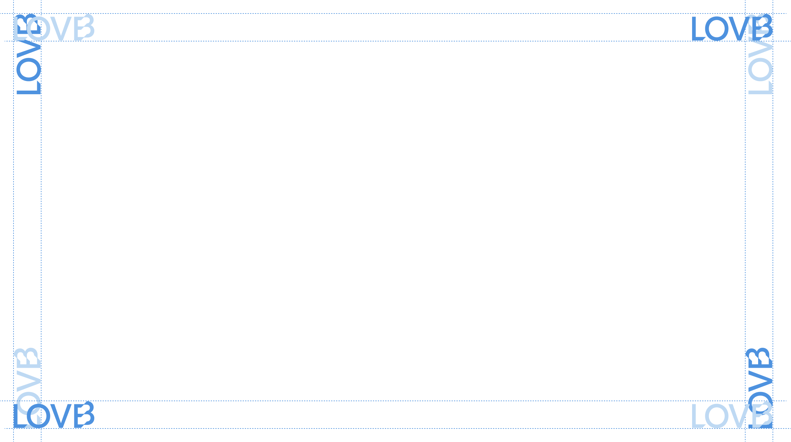
Missuse
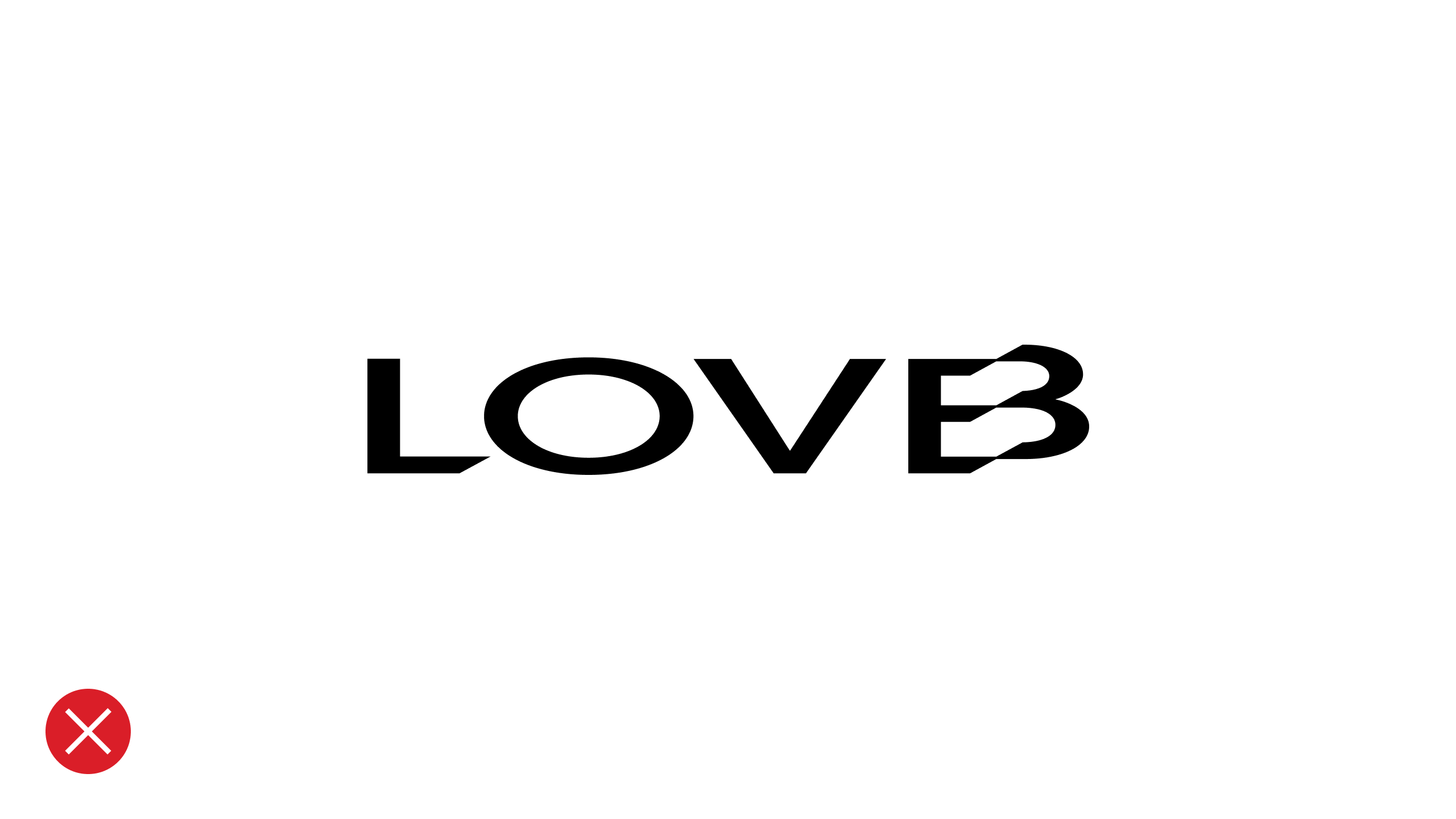
Never stretch the wordmark
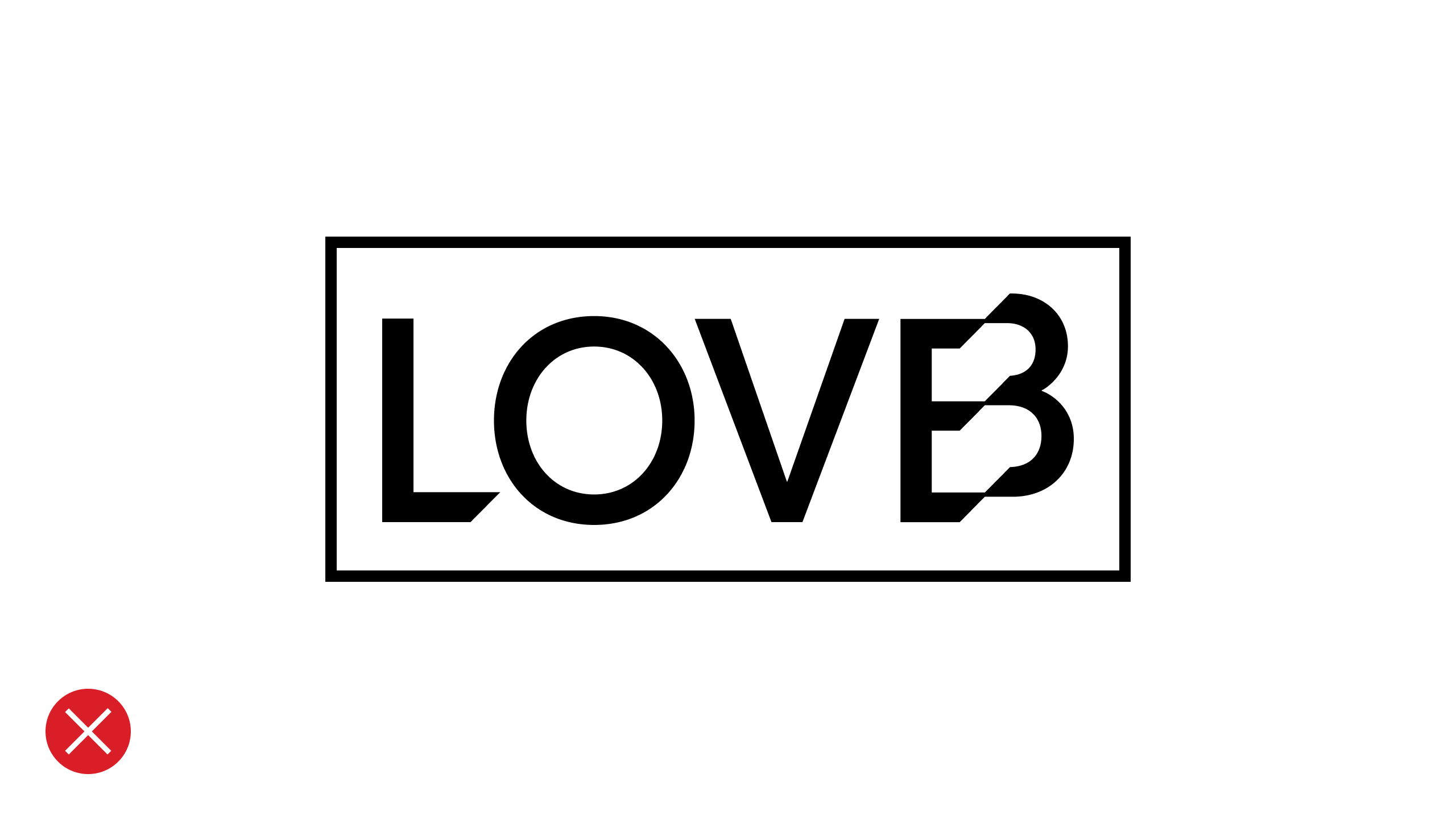
Never add any other elements to the wordmark
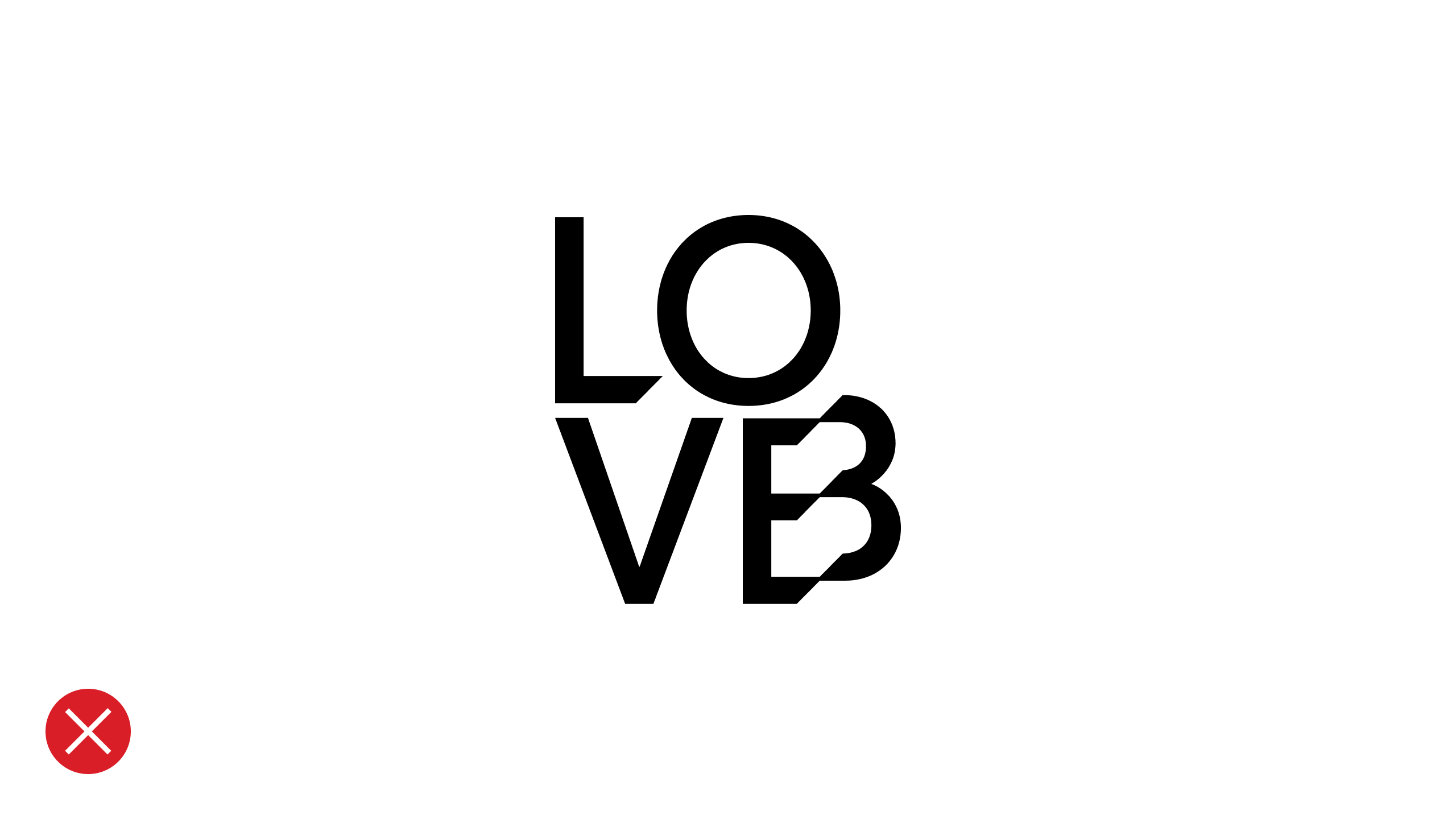
Never split the wordmark
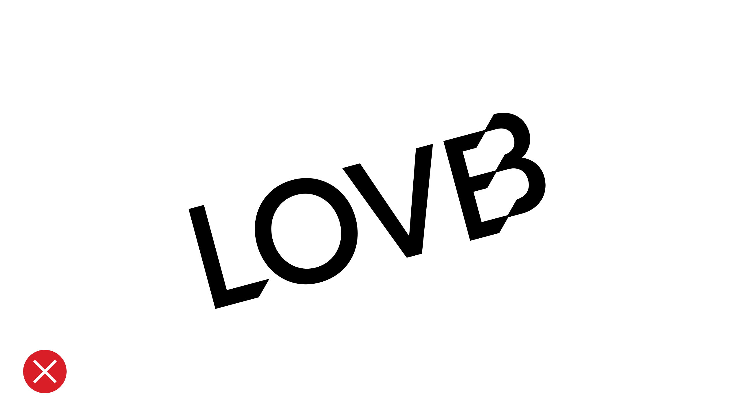
Never position the wordmark at an angle

Always ensure there is enough contrast
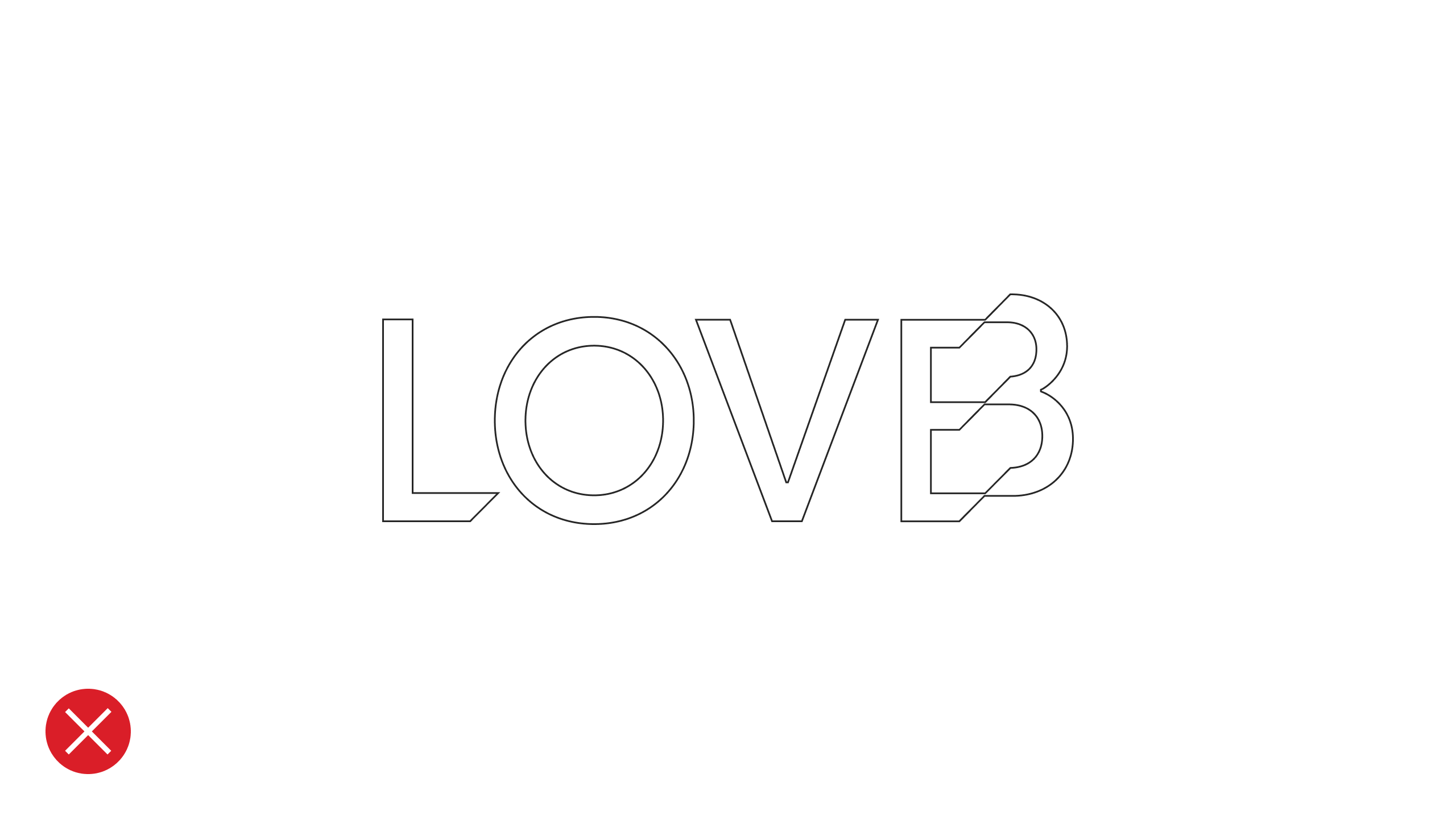
Never outline the wordmark
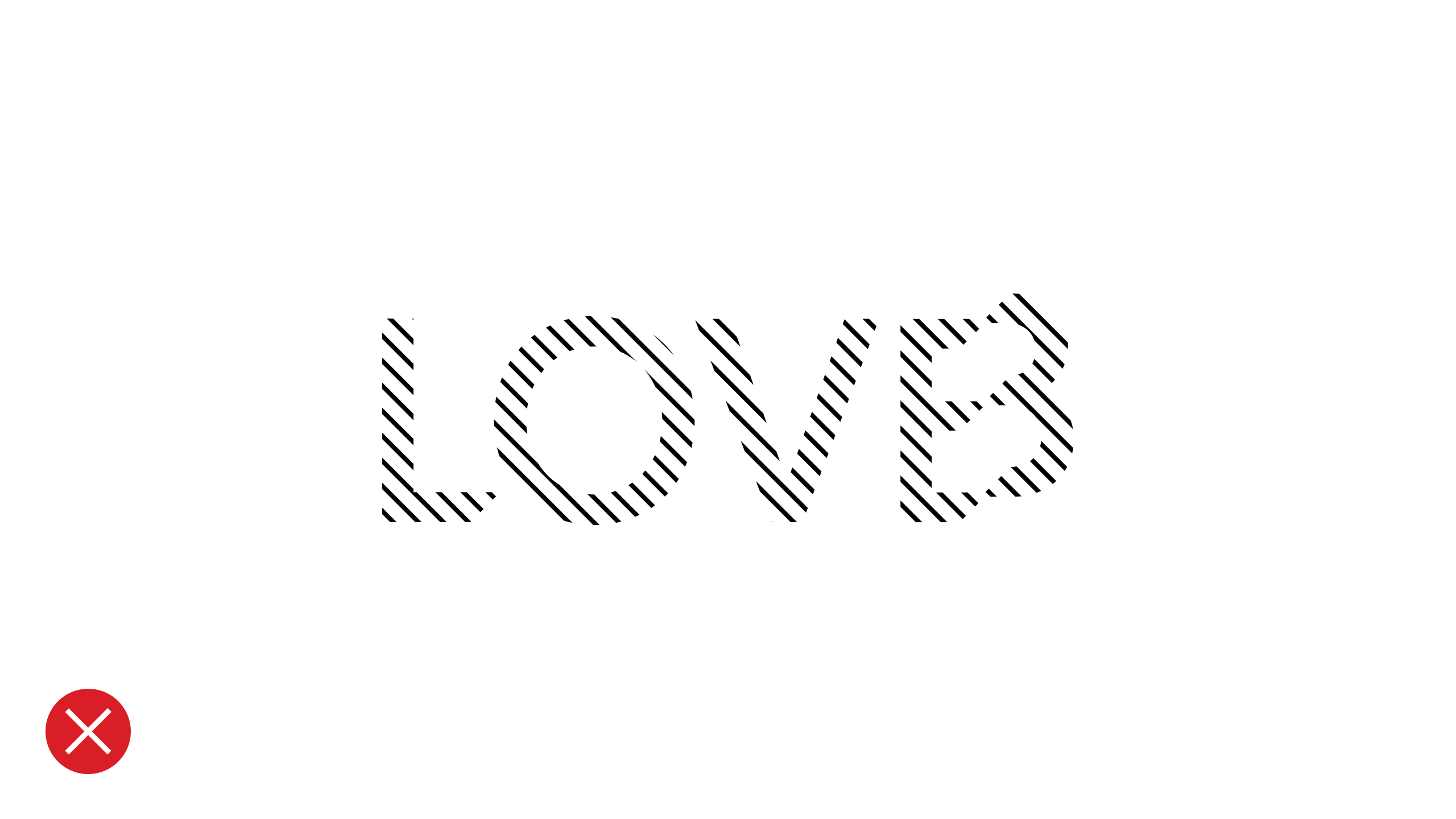
Never apply patterns to the wordmark
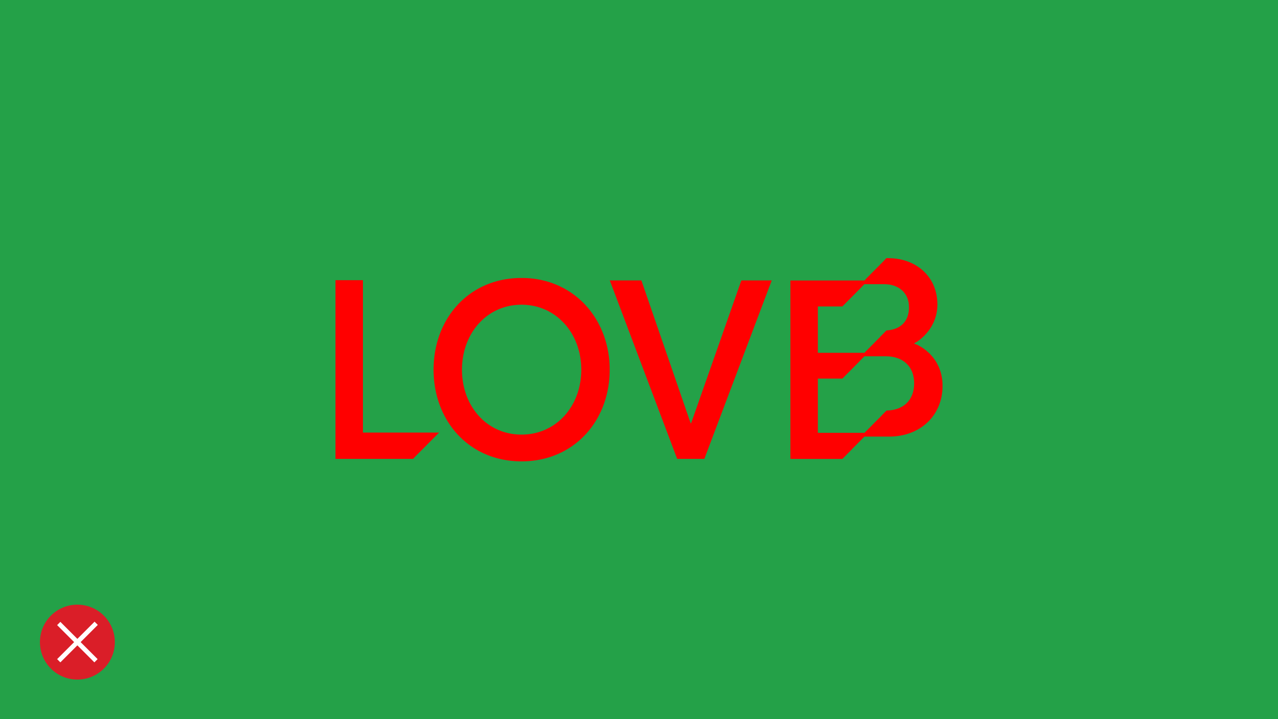
Never use unapproved colors
Resources
LOVB Wordmarks for Print
↓
LOVB Wordmarks for Screen